


How to get the best of your images captured with STELLINA - Affinity Photo tutorial
17 Jun. 2020
Image processing tutorial with Affinity Photo – Intermediate level
Did you know? You can now export the images of your observations in a 16-bit TIFF format. This raw file allows you to apply your own image processing settings and edit the images at your convenience. Doing so, you will get better image quality and personalize the results without the hassle from stacking files yourself on astrophotography software. This tutorial describes a method to process the images obtained from TIFF export using the Affinity Photo software. It explains basic concepts of image processing tools which can be applied using any other graphic design software.
For a more thorough understanding, please read:
Save, share and use STELLINA’s images
CONTENTS
- Introduction
- Processing steps
- Can we proceed further?
Fig 1: The Orion Nebula. Left side: as shown on your screen when observing with STELLINA. Right side: after processing the image via the TIFF export.
Introduction
Requirements
Affinity Photo software
Affinity Photo is a raster graphics editor similar to Photoshop. It is able to export and read Photoshop files (.psd) but it is more accessible than Photoshop because of its price, and its interface is more user-friendly. It is available for Windows and macOS systems. A version for the iPad is also available.
Information and download: www.affinity.serif.com
Rate: about 50€/$50 (one-time purchase)
If you already own image processing software, it probably shares many features with Affinity Photo. So you should be able to draw inspiration from it.
The example file
This tutorial is based on an image of the famous Orion Nebula (M42).You can download the original TIFF file (as you would retrieve it during your observation) by clicking here..
The Orion Nebula is an interesting case study. It has a very bright center – its heart is lit by 4 stars forming a trapeze – with faint extensions. The challenge for any astrophotographer is to enhance the extensions without “burning” the heart.
About the technique used in this tutorial
There is no unique way to process an astronomical image. The vast array of software available on the market and their various functionalities offer many ways to achieve a result. There is also a multitude of possible results. If you process the same image several times with the same tools, you probably won’t get an identical end result.
The method described here is one among many. For this tutorial, we’ve decided to use Affinity Photo, a versatile graphic design software accessible to all, rather than a dedicated astrophotography software.
Be aware that the settings required to process a particular celestial object may significantly differ depending on whether they are nebulae, galaxies or star clusters. Celestial objects can show very different characteristics, even within their category. The advantage of manual processing over STELLINA’s automatic processing is precisely to allow for the treatment of objects differently depending on their features. It is important to understand that this article is not about strictly following the step-by-step tutorial, but rather understanding the notions related to image processing and being able to apply the concepts to other cases.
This tutorial is organized into 5 main steps:
- Revealing the image
- Enhancing the details
- Reducing noise
- Adjusting colors
- Adding the finishing touch
Tips for capturing your images with STELLINA
To obtain the best possible end image quality, you must begin with having all the right parameters in place when capturing photos with STELLINA. Here are a few tips that will positively impact your image’s final quality regardless of the processing technique you use.
- Set up your STELLINA outside about 1 hour before starting your observation. This will allow time for the optical and mechanical components to adapt to the ambient temperature, ensuring a more precise focus (sharp stars, less rejected images…). Stellinapp displays the temperature of the instrument. If you notice a significant drop in temperature, it’s likely your final image will show some defects.
- Target objects that are high in the sky, preferably above 30°. Close to the horizon line, the atmosphere absorbs more light. Furthermore, the more turbulence there is, the more the image quality will degrade. Keep in mind that during your observation, the apparent rotation of the sky will cause the celestial sphere to move. Use a star chart software such as Stellarium to control the height above the horizon of the object you plan to capture and check how it changes overnight.
- The longer, the better: plan for longer exposures. Stellinapp provides minimum observation time recommendations for each target in order to get an image with decent quality. However, by prolonging the capture beyond the recommended time, you can achieve a higher quality result. We recommend that you to double the total exposure time (2 hours if we recommend 1 hour).
- The darker, the better: whenever possible, choose an observation site away from any artificial lights and use STELLINA when the moon is not too visible (new moon, waxing crescent phase…)
- Avoid setting up STELLINA on or near tarred, concrete or rocky surfaces. Those materials release heat at night, which increases the turbulence. Prefer grassy or earthy grounds.
Step 1: Reveal the image
At first glance, when opening it, the TIFF file may confuse you (see figure 2): the image appears almost completely dark. Actually, the signal does exist. What we can see at this point is basically the heart of the nebula with the 4 stars of the trapeze. This image refers to a 30 minutes capture. As mentioned in the tips above, we could have obtained an even sharper result with a 1 hour exposure.
The goal of this step is to expose the extensions of the nebula without burning its heart. While adjusting the settings, you will need to keep checking that the stars of the trapeze and the heart’s details remain distinctly visible.

fig. 2: the image as it appears in Affinity Photo while opening it, with the main interface’s elements.
Once you’ve opened the image with Affinity Photo, take a look at the panels on the right (figure 2). Make sure the” Layer Panel” is visible.
Like most graphics software, Affinity Photo uses a combination of layers that blend together to compose the final image. You can think of layers as being like sheets of paper that are stacked one on top of the other. Transparent areas of a layer reveal the layer below, while opaque parts of a layer obscure the layers below. Some layers may contain an image, while others are adjustment layers that affect all the visible layers below them. All layer management is carried out from the Layers Panel.
So far, we only have one layer with our image on it. To keep this source safe in case we need to start over, we will work on a copy of this layer.
- Click on the layer to select it, and in the “Layer” menu, choose “Duplicate“.
- The new layer appears in the panel. For better organization, let’s rename it “Tone Mapping” (you’ll soon understand why).
Activate the tone mapping mode: “Tone mapping persona” (see figure 2). Tone mapping is the equivalent of the HDR filter feature you can find in other photo editing software. This tool is particularly useful for images with a high dynamic range, which is the case with a 16-bit TIFF file.
For a better understanding of: The role of tone mapping.
The range of shades that a computer screen can display (the dynamic) is much smaller than that of the TIFF file (256 levels per color for the screen vs. 65536 levels per color for the TIFF file). This is why we only see the very bright parts of the image on our screens.
Tone Mapping is the process of taking a range of tones and remapping them to a smaller range that most devices can accurately reproduce. Proceeding this way will reveal the fainter areas and locally increase the contrast in the picture without impacting the overall contrast (which would result in dimming the dark areas – low light – and would highlight the brighter ones, the opposite of what we are trying to achieve).
Use the controls available on the right-side panel to apply the relevant settings (Figure 3).
- To adjust the overall brightness of the image, move the “Tone Compression” slider to low values, about 10%.
- To bring out the less bright parts of the nebula, increase the value of the “Local Contrast,” for example, to 30%.
- Slightly increase the “Blackpoint” value to darken the sky. During this step, don’t try to get an entirely dark sky background. You may lose details in the low lights. For example, set the slider to 3%.
- To protect the brightest areas from being burnt, activate the “Shadows and highlight” panel, and reduce the highlights to minus 100%.
You can try different settings to find a result that suits you best. Take care not to burn the heart of the nebula. If the stars of the trapeze are slightly burnt, we will be able to rectify this in the next steps.
These are the only settings to be made in the “Tone mapping persona“. Click on “Apply” (top left) to return to the standard mode.

fig 3: the interface of the “Tone mapping persona” with the settings to be made.
We now have an image that looks more like the Orion Nebula as we know it. By zooming in on the stars of the trapeze, we may notice that they are slightly burnt. In our primary image (which is still on the layer underneath), they were perfect. For this area only, we will try to let the underlying layer appear.
To achieve this, we will use the blend options (the goal of this feature is explained more in-depth in part 3).
- Make sure the “Tone Mapping” layer is selected.
- At the top of the Layer Panel, locate the gear icon “Blend Ranges” (see figure 2) and click on it to display the layer blending options.
- A new panel opens with two diagrams. Adjust the curve in the right-hand chart ((Underlying Composition Range))so that it looks like Figure 4.
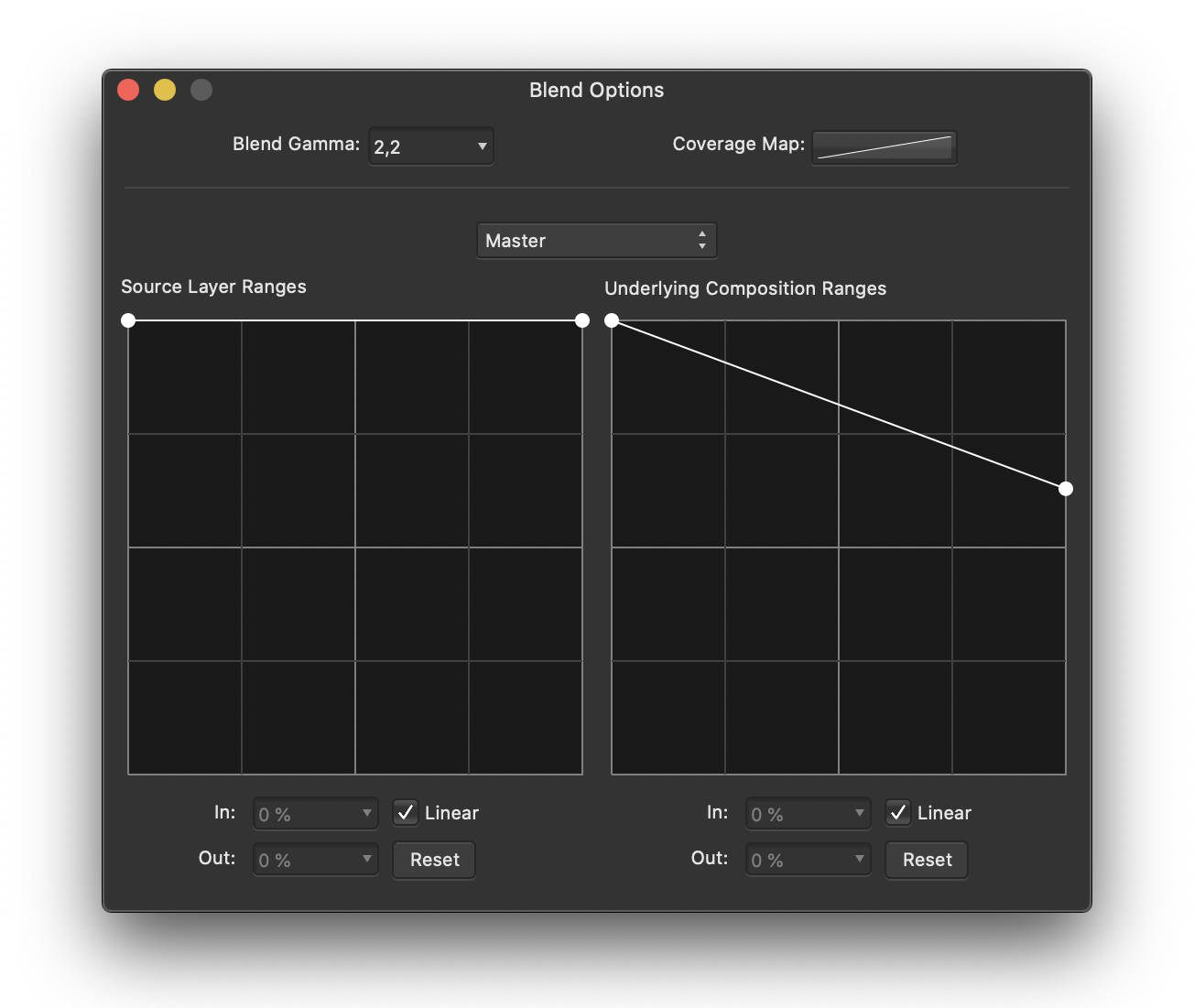
fig 4: setting the blending options for the “Tone Mapping” layer.
At this stage, the trapeze stars should no longer be burnt. We’ve revealed the underlying layer only for the very bright areas (where the stars in the trapeze are perfect).
This step is complete. The figure below compares the image at its opening in Affinity Photo with the result you should have at the end of step 1.
fig. 5: comparison before/after step 1
Step 2: Enhance the details
Now that we can clearly visualize the nebula, let’s try to enhance more details.
To achieve this, we are going to use a tool that looks intimidating at first glance, but is quite powerful: Tone Curves.. This adjustment is available as an adjustment layer.
- At the bottom of the Layer Panel, click on the “Adjustment” icon (see figure 2) then choose “Curves” in the drop-down menu.
A new layer is created, and the proper setting panel opens (figure 6 on the left).

fig 6: the tone curve, prior and post adjustments.
For a better understanding of: Tone curves
The tone curve graph allows you to selectively increase or decrease the brightness of the image’s areas according to the brightness they already have. For example, you can decide to increase the brightness of dark areas without changing the brightness of areas that are bright enough.
The left side of the graph (Figure 6 on the left) stands for the very dark tones, called shadows (or blacks), while the right side refers to the very light tones ( “whites”). In between are the dark mid-tones and the light mid-tones.
The vertical axis of the graph shows the brightness value for each tone: minimum (black) at the bottom, and maximum (white) at the top. At first, the curve that runs through the graph consistently indicates that the shadows (on the left) are extremely faint, and the highlights on the right are very bright.
By clicking on the curve, you can change its shape in order to increase the brightness level of a particular tone range without impacting the other tone ranges too much.
In our case, we would like to increase the brightness of the dark tones without increasing the highlights in order to avoid burning the nebula’s heart.
- Click on the curve on the dark tone side to add a control point and then move it upwards to increase the brightness of this tone range.
As a result, we enhance the darker areas, but burn the very light ones. We therefore need to add another control point on the curve to retract the brightness of the highlights to their initial values.
- Add the required control points to the curve to get a shape similar to the one shown in Figure 5 on the right.
- Check that the details of the heart and the stars of the trapeze remain distinctly visible.
To complete this step, we are going to apply a detail enhancement filter.. Before proceeding, let’s flatten, i.e., merge, the layer containing our original image (called “Background” if you have not modified it) with the “Tone Mapping” layer.
- Uncheck the box next to the layer named “Curves setting” to temporarily disable the effect of this layer.
- Right-click on one of the other layers to bring up the layer contextual menu.
- In the contextual menu, choose “Merge visible“.
A new layer has been created. The initial layers are still available in case we need to go back to the previous steps.
- Ensure that the new layer is between the “Tone Mapping“layer and the “Curves Adjustment” layer.
- Activate the layer named “Curves adjustment” again by checking the relevant box.
- Rename the newly created layer “Clarity“.
- Make sure that the “Clarity” layer is selected, then in the menu “Filter / Sharpen…” choose the option “Clarity…“
- Adjust the intensity of the filter to increase the level of sharpness according to your preferences. Preserve the heart and stars of the trapeze. For example, you can set it to 40%.
- Click “Apply“.
- You can still adjust the tone curve settings if needed. This is the advantage of the adjustment layers: they produce non-destructive modifications and can be changed later.
This step is complete. The figure below compares the image between the beginning and the end of Step 2.
fig. 7: comparison before/after step 2
Step 3: Reduce the noise
When we zoom in on the image, we notice the presence of “noise.” Noise is the kind of granulation that appears, particularly in the darker areas of the picture.
The noise is distributed randomly and evenly throughout the image. It is less noticeable in bright areas as the brightness of the noise is low and therefore disappears in the strong “signal” of the bright areas.
For a better understanding of: what causes image noise?
Noise is initially present on any image captured by an electronic device. It can be produced by the image sensor and circuitry of a digital camera. It’s possible to limit the noise generated by the sensor by cooling it. This is why some experienced astrophotographers and professional astronomers use cooled cameras.
When processing an image, the various adjustments performed to enhance the details may increase the image noise. Let’s see how to limit that noise, in order to preserve the image quality.
Please keep in mind that by reducing the noise too much, we could loose some of the smallest details. Therefore, it’s important to keep a balance and accept that a certain amount of noise will always be present.
- Duplicate the “Clarity“, layer to keep a back-up copy in case you want to revisit ((Layer menu / Duplicate)).
- Rename this new layer “Noise Reduction“.
- Make sure that the new layer is selected, then in the “Filters / Noise” menu, choose “denoise“.
- Zoom in on a faint area of the nebula that has details and where noise is more noticeable. Use the “Luminance” setting to find a suitable compromise between noise reduction and loss of details. For example, you can set the luminance slider to 20%.
- Click “Apply“.
Noise reduction has been applied to the whole image. We’ve seen that the noise was less noticeable in the bright areas. It would be interesting to apply the noise reduction only in the darker areas and then keep all the details in the bright areas.
You can achieve this by setting the blending options of the “Noise Reduction“layer. Indeed, we can indicate that the bright areas of the layer “Noise Reduction” become transparent. By doing so, the underlying layer “Clarity” which retains all the finest details, remains visible for that part of the image.
- Select the “Noise Reduction” layer.
- At the top of the Layer Panel, click on the gear icon “Blend Ranges“.
The Affinity Photo setting panel that opens shows two graphs that look like the tone curves we are now familiar with. They work similarly. Let’s pay attention to the diagram on the right “Underlying Composition Range“. It allows you to specify which tone ranges (black, dark, light, white) should become transparent (more or less) to show the underlying layers.
Like the tone curve graph, the left part of the diagram refers to dark tones and the right side to light tones. Our goal is to make the lighter parts transparent. Then the “Clarity” layer appears through only for the brighter areas, and the “Noise Reduction” layer remains visible on the darker areas where it is most useful.
- Click on the control point at the top right of the graph (the one that affects the white areas) and drag it downwards.
- Once at the bottom, slide it to the left as well. Watch the image to control how the noise varies to find the right setting.
The noise reduction layer no longer affects the highlights.
- To ensure the “Noise Reduction” layer affects all the darker areas, slightly move the control point at the top left of the curve (shadows) to the right.
The graph should look similar to the illustration below.
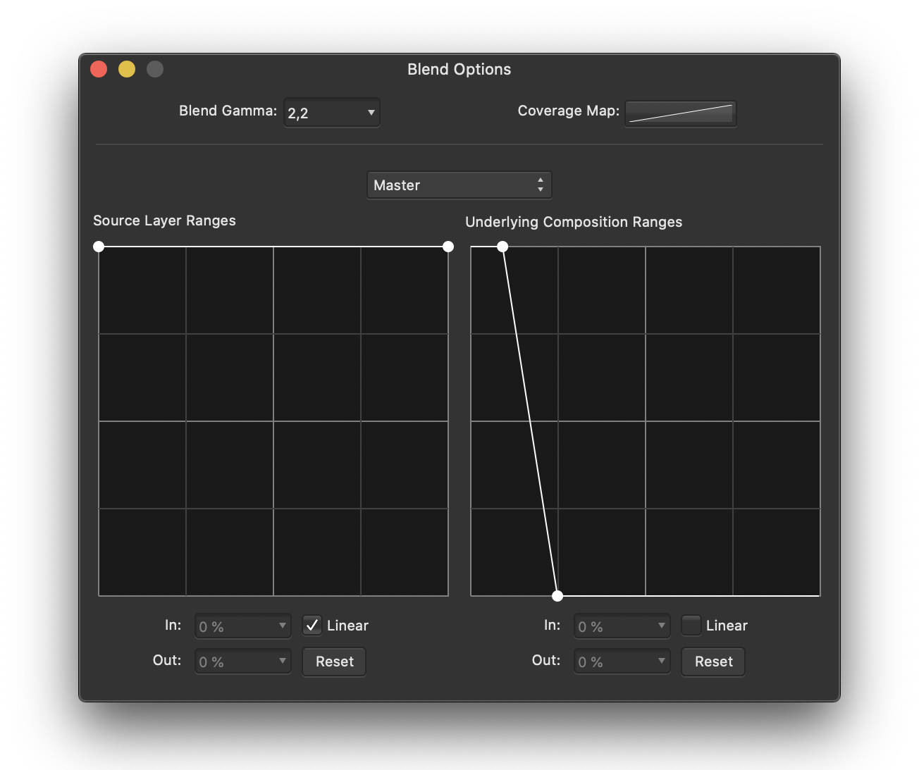
Fig 8. Blending options to be applied to the “Noise Reduction” layer.
This step is complete. The figure below compares the image between the beginning and end of Step 3.
Fig. 9 comparison before/after step 3.
Step 4: Adjust the colors
We have now reached the most creative step that will allow you to personalize your image with Affinity Photo.
So far, our Orion Nebula is quite pale compared to the images we are used to. Let’s enhance the colors and adjust them to get a look that suits us.
- Select the upper layer “Curves Adjustment“.
- Click the “Adjustments” icon at the bottom of the Layers panel and choose “Vibrance” from the drop-down menu to add a “Vibrance” adjustment layer.
- Move the “Vibrance” and “Saturation” sliders to their maximum values.
- Click on the “Adjustments” icon at the bottom of the Layers panel and choose “Selective Color” from the drop-down menu to add a “Selective Color“adjustment layer..
The “Selective Color” adjustment layer allows you to apply color changes to a specific hue. Since the Orion Nebula is mostly red, we will work mainly on this hue.
- In the Selective color setting panel, select “Red” from the top color drop-down menu.
- Set the “Cyan” slider to -100% (to remove cyan in red tones), the “Magenta” slider to +50%, and the “Yellow” slider to +100% to add each of these tones in proportion to the red tones.
- In the color menu, choose “Magenta” then set the sliders to “Magenta” and “Yellow” to + 100%.
- Eventually, in the Colors menu, choose black and place the “Black” slider at +5% to slightly darken the sky background and to add more contrast to the image.
At this point, the nebula appears quite pink, and we would like it to be more reddish. We can add a second “Selective Color” adjustment layer whose effects will cumulate with the first one.
- Click on the “Settings” icon at the bottom of the Layers palette and choose “Selective Color” from the drop-down menu to add a “Selective Color” adjustment layer.
- Select the color red from the menu and set the Cyan slider to -15%, Magenta to +35%, and Yellow to +100%.
The values given above for color correction are an example, and it is up to you to define how you want the nebula to look.
This step is complete. The figure below compares the image from the beginning and the end of step 4.
Fig. 10 comparison before/after step 4
Step 5: Put the finishing touches
Our nebula now looks very different from what it was on the smartphone or tablet display while we were observing with STELLINA: it is more detailed.
There are still some defects that we can try to eliminate or mitigate.
To begin with, the edges of the image show defects related to the capture. Let’s crop the image to remove the altered areas.
- Select the “Crop” tool from the left side toolbar (Figure 2), then adjust the frame and click on Apply.
he lower right corner of the image still shows a kind of unsightly halo. Let’s dim it by applying a dark gradient over it.
- Make sure that the top layer “Selective Color Adjustment,” is selected. At the bottom of the Layers panel, click on the “Add Pixel Layer” icon (see figure 2).
A new empty layer is added to the stack. Rename it “Gradient”.
- Select the “Gradient” layer.
- On the left toolbar, select the “gradient” tool (see figure 2).
- On the image, draw a short gradient from the lower right corner to the upper left corner at about 1/6th of the diagonal.
A control point is available at each extremity of the gradient to choose the color.
- Select the control handle on the bottom right corner of the image.
- Activate the “Color” panel in the right-hand setting panels and select the black color for this control point.
- Select the second control handle. Select the black color and a 0% opacity.
- Adjust the position of the second control point so that the gradient covers only the concerned area, without masking the wisps of the nebula.
- Now reduce the opacity of the “Gradient” layer to about 40%.
This step is complete. The figure below compares the image from the beginning and end of step 5
Fig. 11 comparison before/after step 5
Should we go further?
We can now consider that the processing of the Orion Nebula image from STELLINA’s 16-bit TIFF export on Affinity Photo is complete. We have managed to get a more detailed image, with colors that are quite natural. We have also preserved the heart of the nebula, which highlights many details.
When it comes to image processing, the users can be tempted to go further to see more colors, more details, accentuate further details and colors. How do you know when you should stop?
There are no laws or rules regarding image processing. However, a good indicator that the image processing is sufficient is that the image looks natural. Further processing will result in the details being more detailed. Yet, the result may not look natural even to the untrained eye. Furthermore, too much image processing may accentuate the defects in the image.
Experimenting and comparing your results with others is the key to learn how far you can go.
To end this tutorial, here is a way to improve the image a bit more while keeping the ability to balance this improvement in case you have regrets (and without having to start the processing over again).
- Temporarily disable the “Gradient” layer.
- Right-click on one of the layers to select the contextual menu and choose “Merge visible“.
- Place the newly created layer between the “Gradient” layer and the “Selective Color adjustment” layer.
- Select the new layer and rename it “Extra peps“.
We are going to use the tone mapping persona again to enhance the details on this layer.
- In the top toolbar, click on “Tone mapping persona“.
- Set the tone compression to 0% and the local contrast to about 20%.
- Click “Apply“.
- Activate the “Gradient” layer again..
By doing so, we have just created a layer of the image with enhanced sharpness. But we have also accentuated the defects.
To balance the effect, we can adjust the opacity of this layer to more or less blend with the underlying layers.
We can also set the blending options for this layer to affect only the highlights of the image where the details actually are and preserve the dark areas where defects are more easily visible. Proceed in the same way as you did with the “Noise Reduction” layer by adjusting the blend ranges.
Here is what the curve might look like:
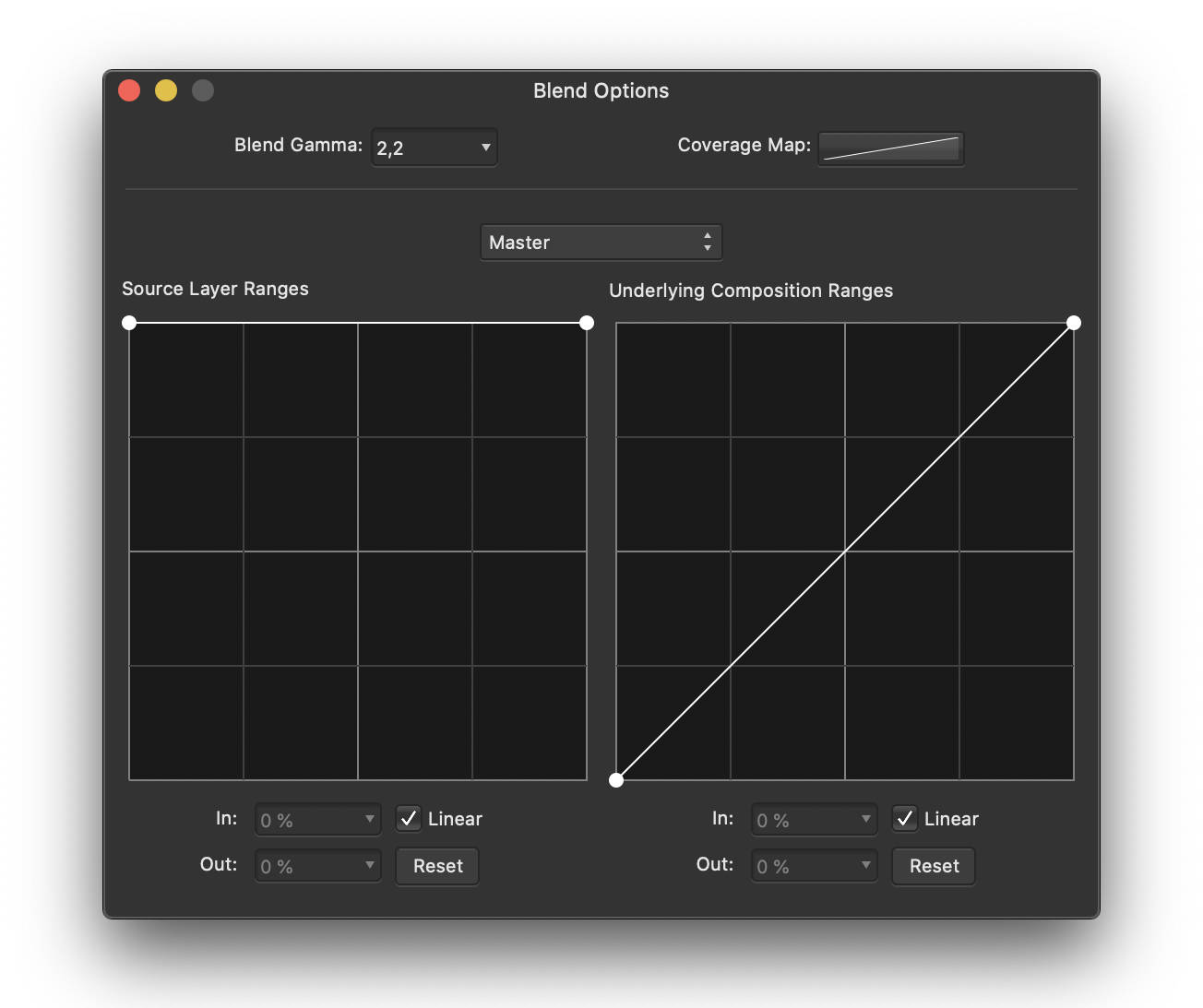
fig.12: blending option settings for the “Extra peps” layer
Congratulations, you’ve reached the end of this tutorial! Don’t forget that each celestial object is different and will require custom settings. The more time you spend on Affinity Photo, the more experienced you will become and you will see progress. Ask for feedback from fellow amateur astrophotographers.
Please share the results of your work on social networks and in the #myStellina Facebook group.
- To save your Affinity Photo working file, choose “Save As” from the file menu.
- To export your image for sharing, select “Export” from the file menu.
You can download the Affinity Photo file (NB: the photo is in low resolution) used in this tutorial by clicking here..